Look below to see what data set you will use to create your choropleth map.
Map must be NEAT, ACCURATE, and INCLUDE all MAP ELEMENTS (obviously including legend).
Please disregard the number that I gave you in class.
- Moira - Literacy: Female lit. rate as % of male lit. rate
- Pamela - Labor: Female professional and technical workers
- Red - Labor: Female legislators and senior officials and managers
- Jun - Education: Secondary school gender parity in gross (look this up to figure out what the heck it means)
- Tommy - Education: Average length of schooling
- Minki - Children's Health: Child Mortality Rate
- Francis - AIDS/HIV: Adult females living w/ HIV as % of total
- Anton - Water and Sanitation: Access to improved Sanitation (look this up to see what it means)
- Ida - Public Health: Maternal Mortality Rate
- Floyd - Urban and Rural Areas: Urban population as % of total
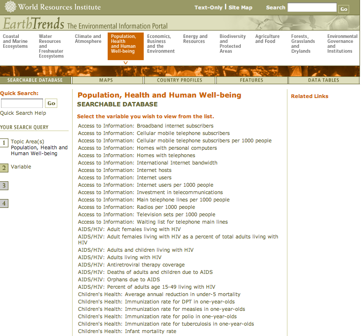
- Dennis - Access to Information: Internet users per 1000
- Cyril - Children's Health: Infant mortality rate (you may also use population data sheet for this information)
- Doenemi - Children's Health: Underweight children under 5
- Daniel - GNI PPP (use population data sheet)
IMPORTANT!!!
Highlight all of the countries to get the data for all the countries at once.

Make sure that you understand your indicator, the units (is it a %, number per 1000, $?), and what it is actually telling you. If you don't understand, look it up, or click on the "view technical notes" of your data set.

Use the most current data possible that is the most complete. For example, if you click on 2008 but there is only data for a few countries, try clicking on 2007 or 2006 and see if there is more information for more countries. (See screenshot below.)

Countries with no data should be GREY. (Unless you are using the color black, then you need to figure out something else that won't be confusing to readers.)


